Colors of Post Impressionism in The Metropolitan Museum of Art
What colors did post-impressionist artists use for their masterpieces? Here are 4 artists' oil paintings in Metropolitan Museum of Art.
We can analyze colors from each painting to find a regular pattern of artists' color preferences. We can see the connection between the colors and the objects that artists painted and maybe learn to mimic post-impressionism's sense and feel when drawing.
Artists
Georges Seurat
Paul Cezanne
Paul Gauguin
Vincent Van Gogh
Swatch
Color swatches were created in the following order:
Vibrant
Muted
Dark Vibrant
Dark Muted
Light Vibrant
Palette
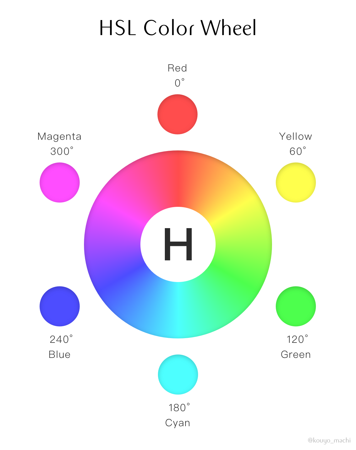
The color palette was created by the category of Hue:
The six hues in the HSL system are listed as
Red | Yellow | Green | Cyan | Blue | Magenta
Swatches from Georges Seurat
4-5 colors in a swatch represents the painting's vibrant, muted, dark-vibrant, dark-muted, and light-vibrant colors.
Seurat's Color Palette
All the colors in swatches are divided by 6 hues.
Swatches from Paul Cezanne
4-5 colors in a swatch represents the painting's vibrant, muted, dark-vibrant, dark-muted, and light-vibrant colors.
Cezanne's Color Palette
All the colors in swatches are divided by 6 hues.
Swatches from Paul Gauguin
4-5 colors in a swatch represents the painting's vibrant, muted, dark-vibrant, dark-muted, and light-vibrant colors.
Gauguin's Color Palette
All the colors in swatches are divided by 6 hues.
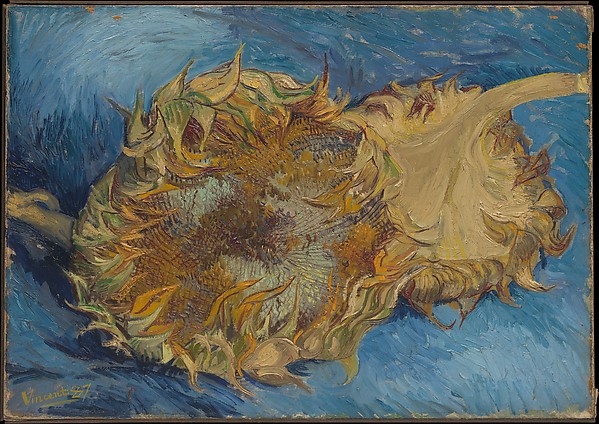
Swatches from Vincent Van Gogh
4-5 colors in a swatch represents the painting's vibrant, muted, dark-vibrant, dark-muted, and light-vibrant colors.
Van Gogh's Color Palette
All the colors in swatches are divided by 6 hues.
Who uses each hue the most?
Comparing the palettes from 4 artists, here are the rankings for each hue.
(ƒ) Formula: Total in a hue from a palette / Total paintings